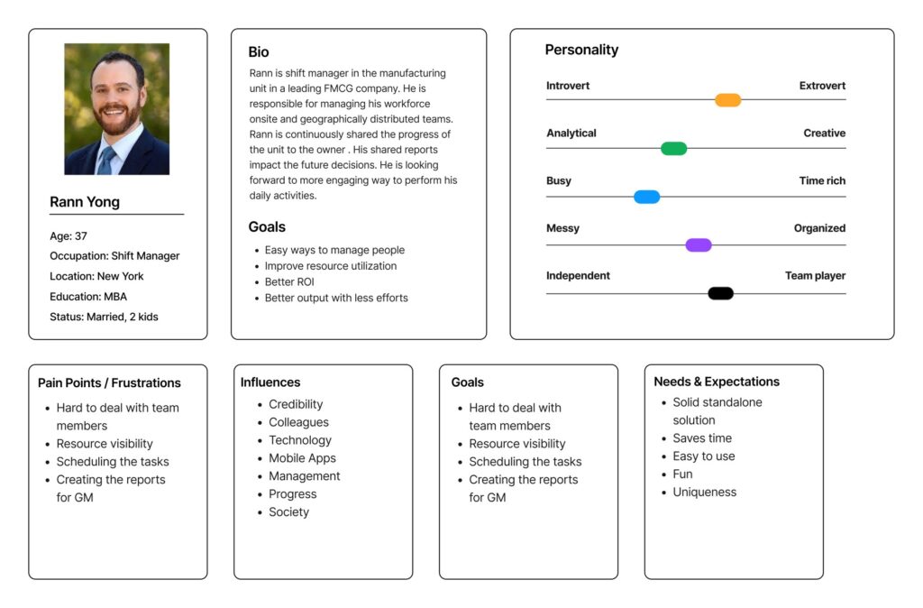
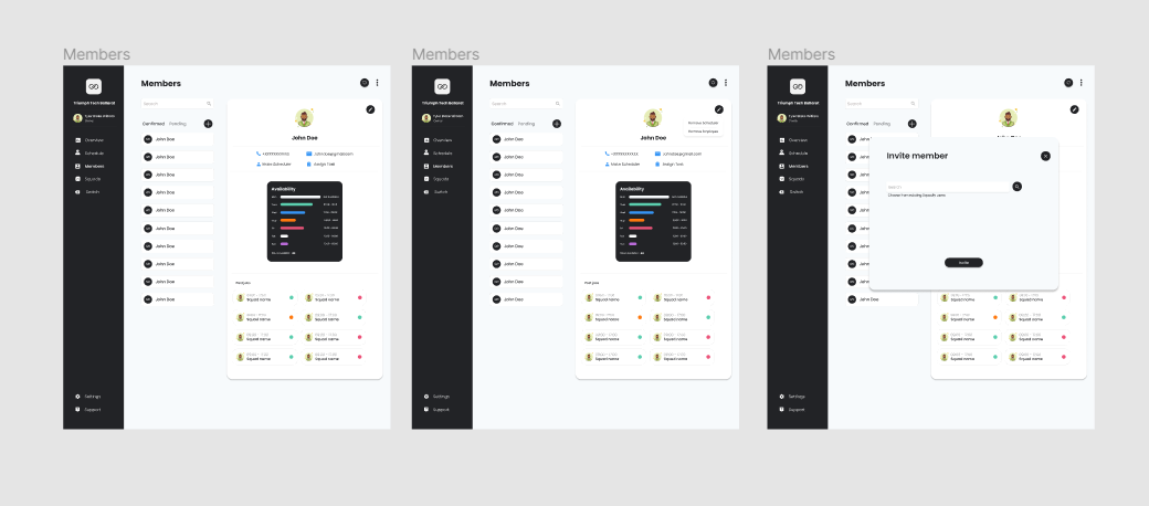
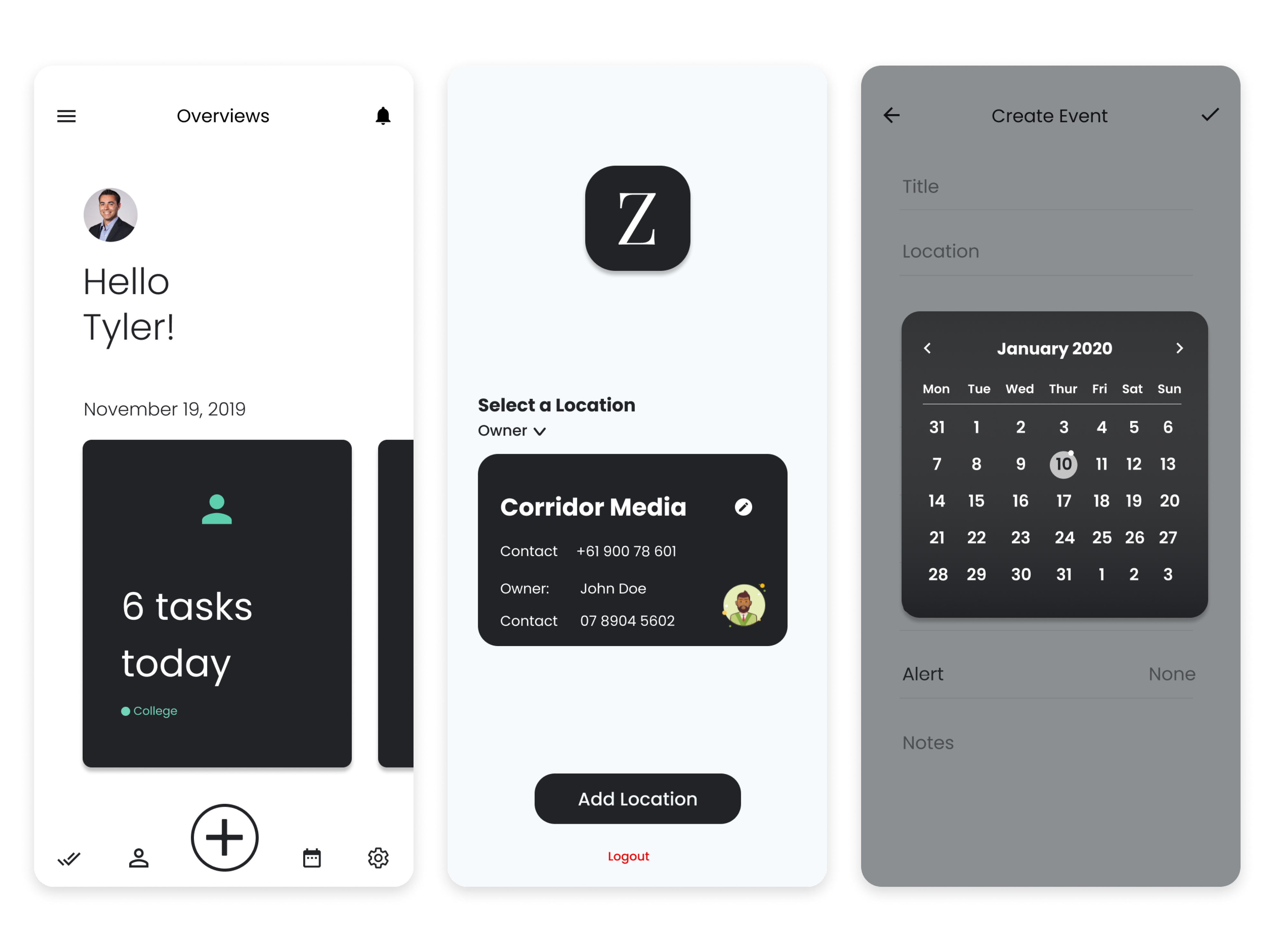
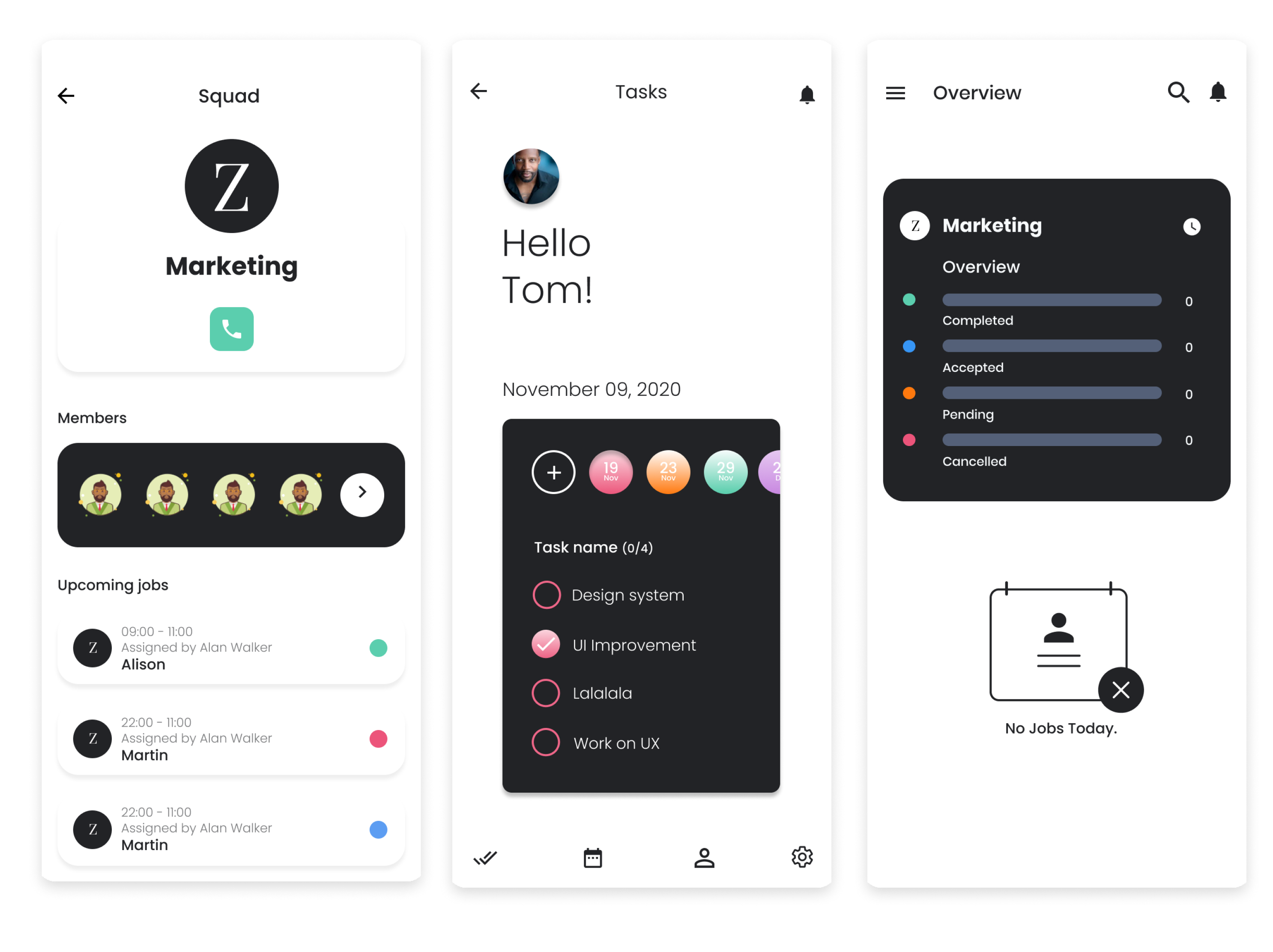
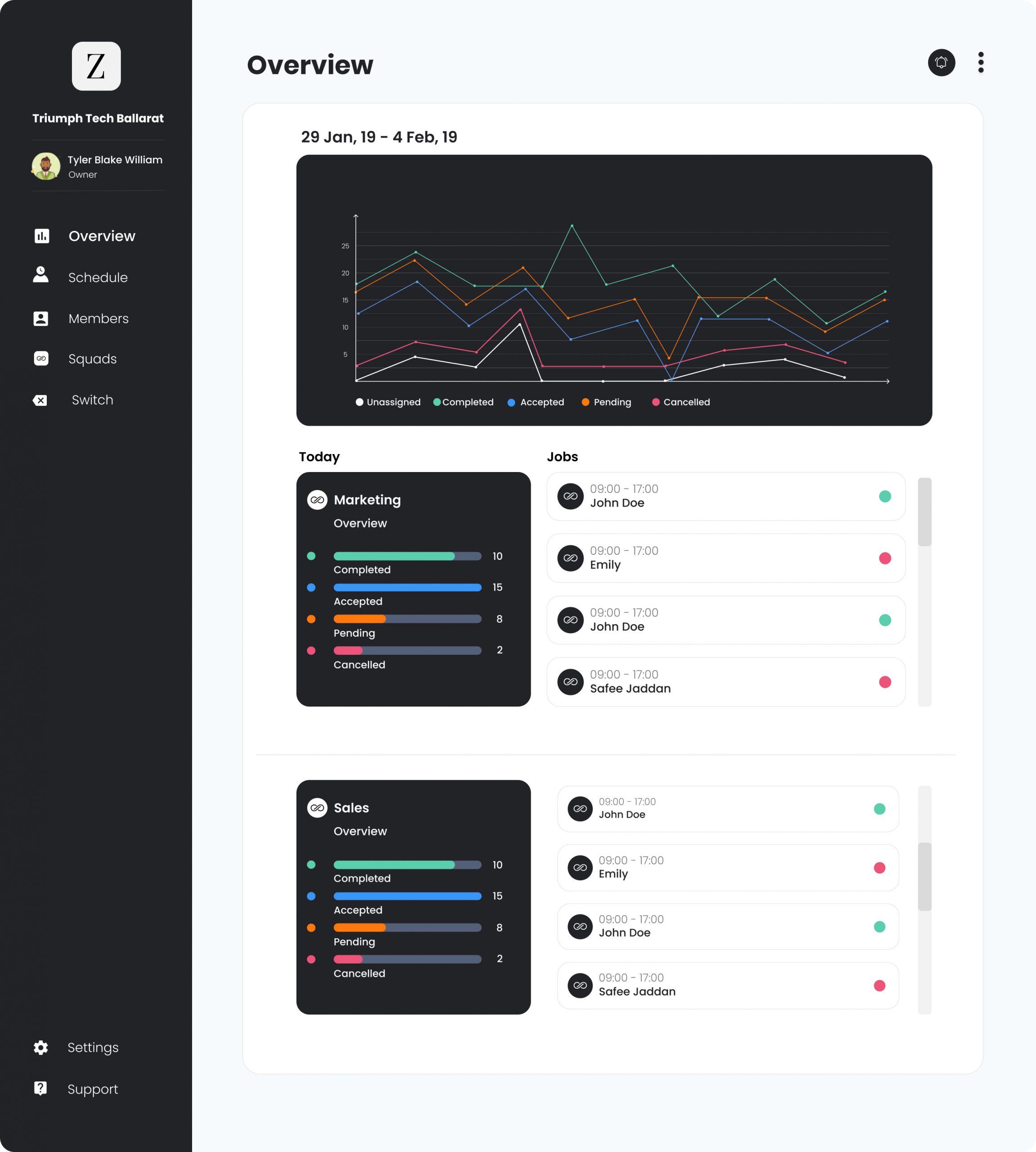
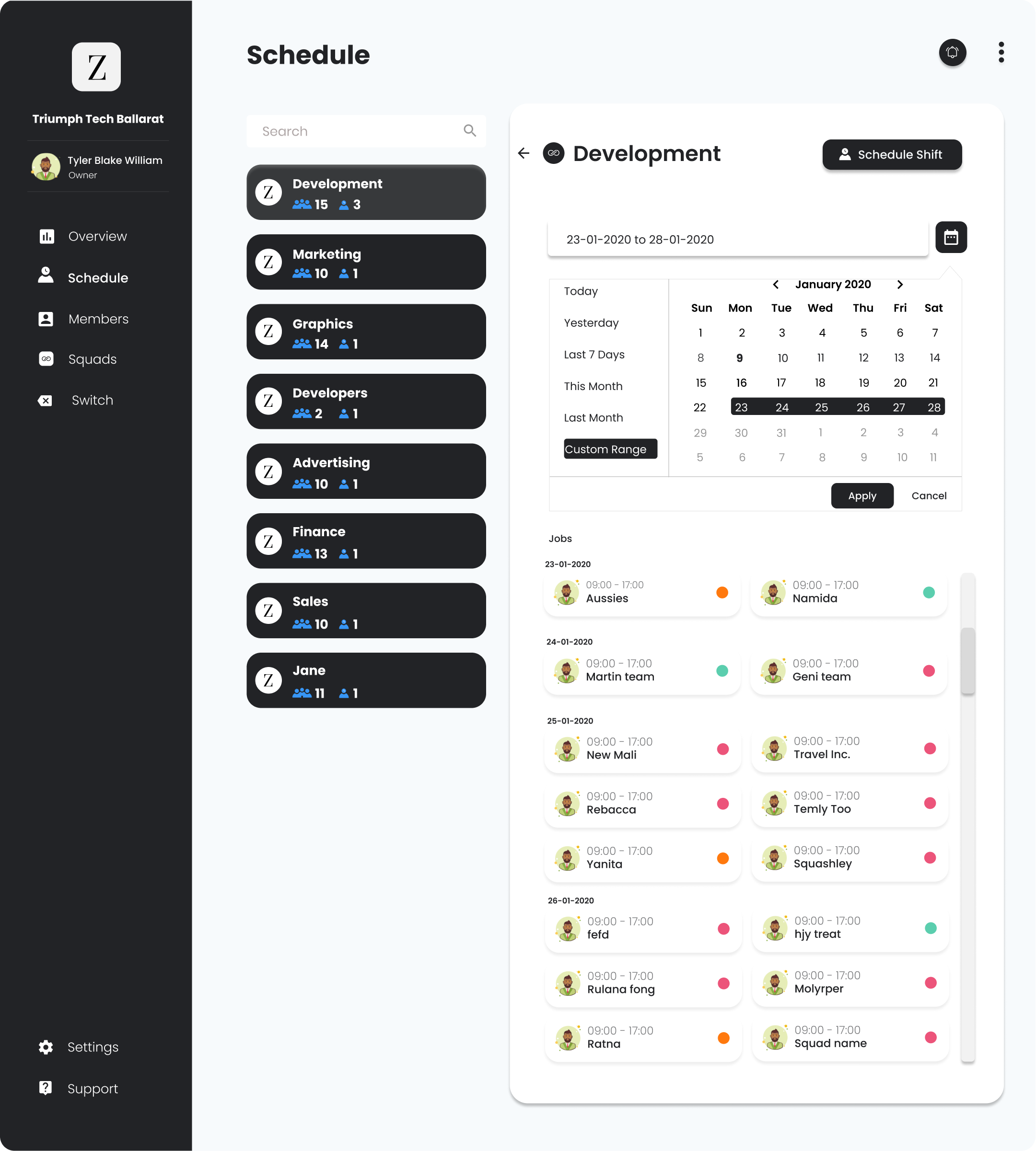
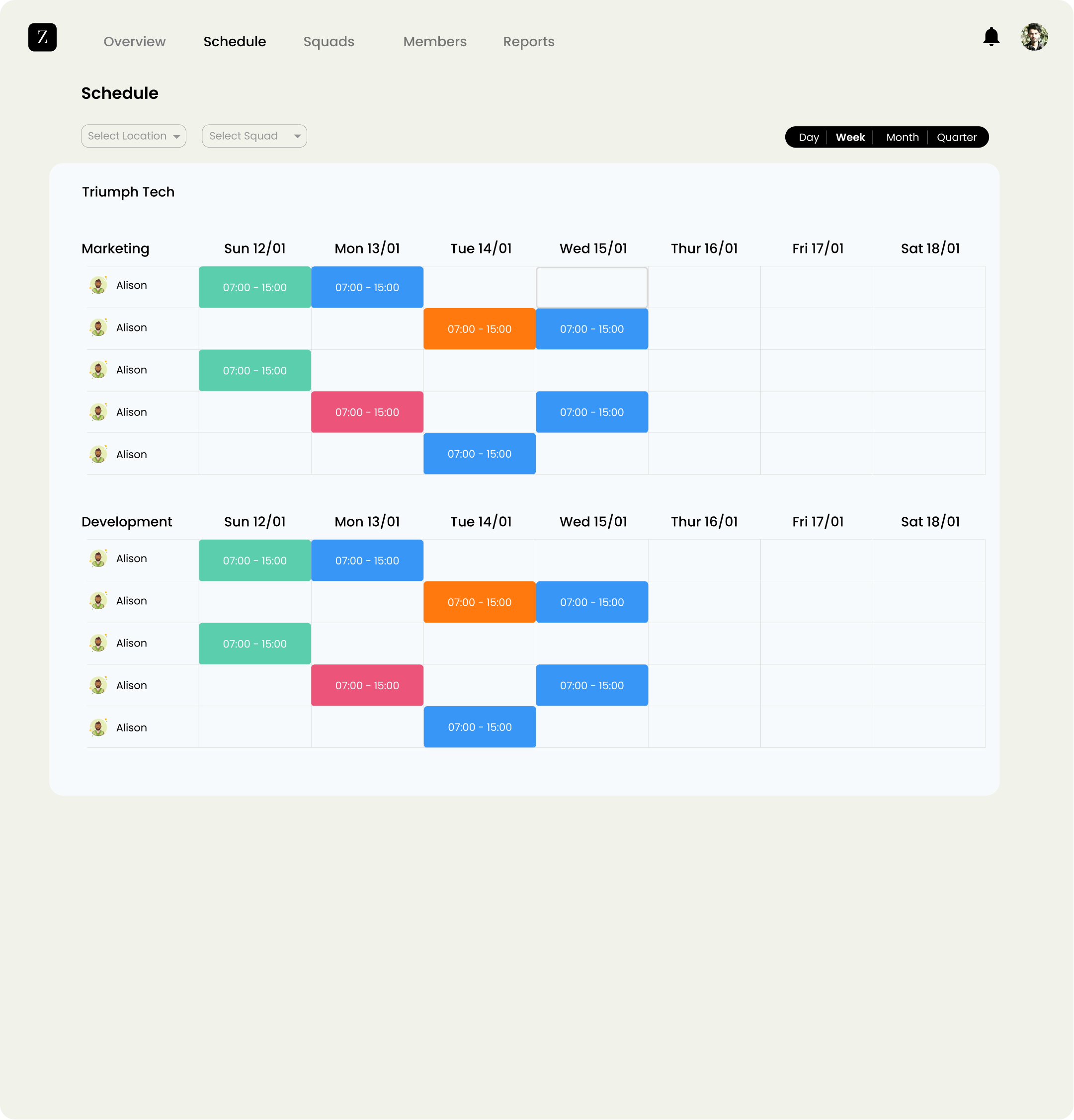
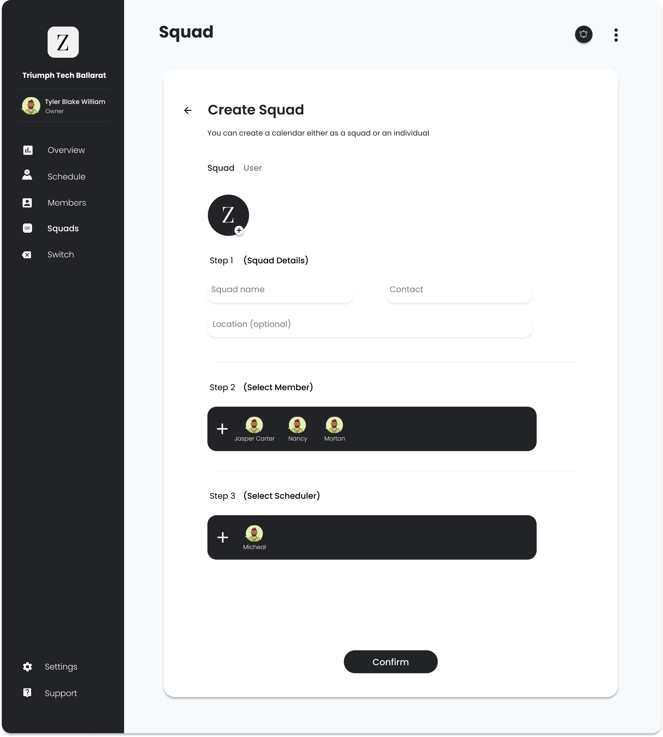
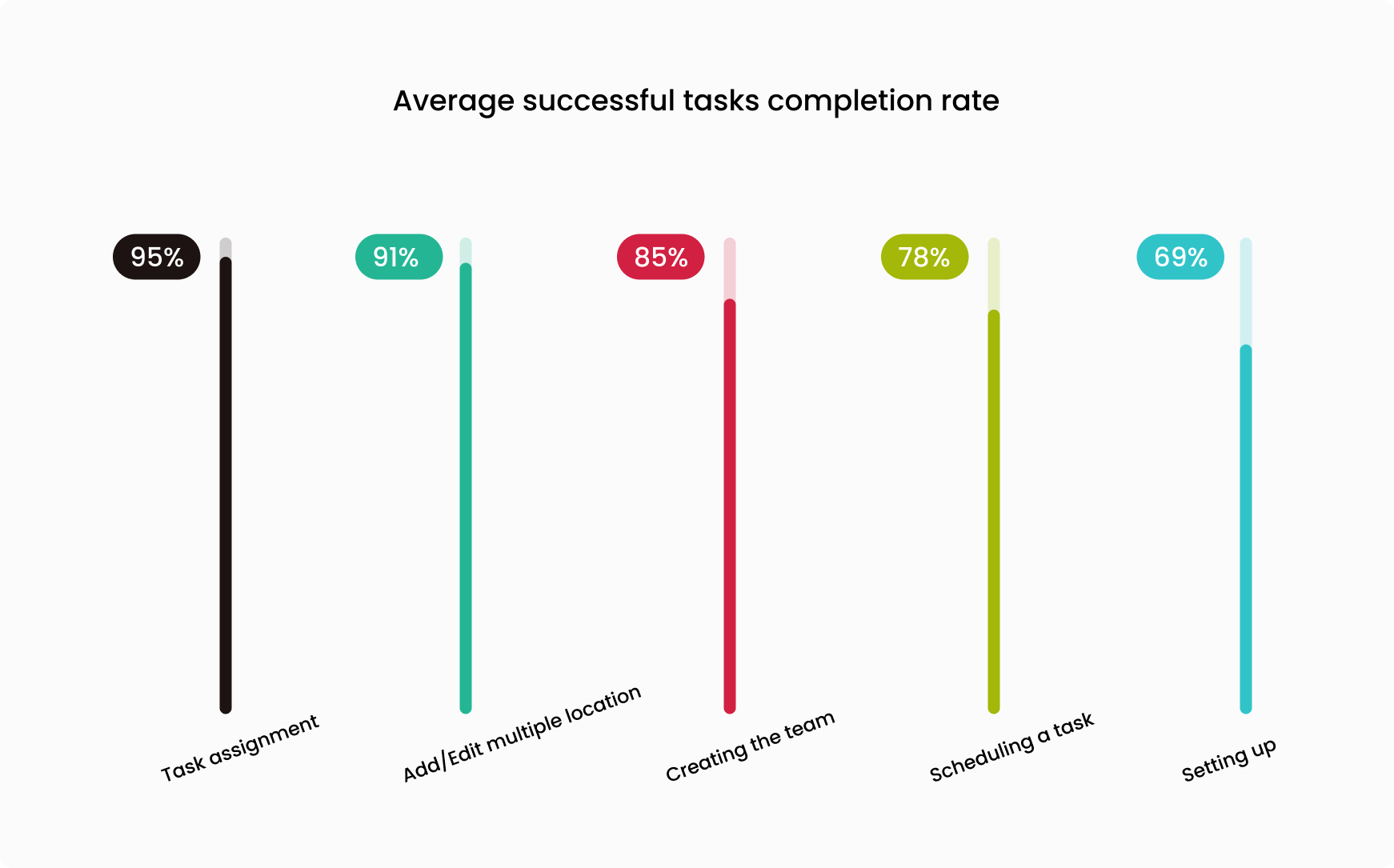
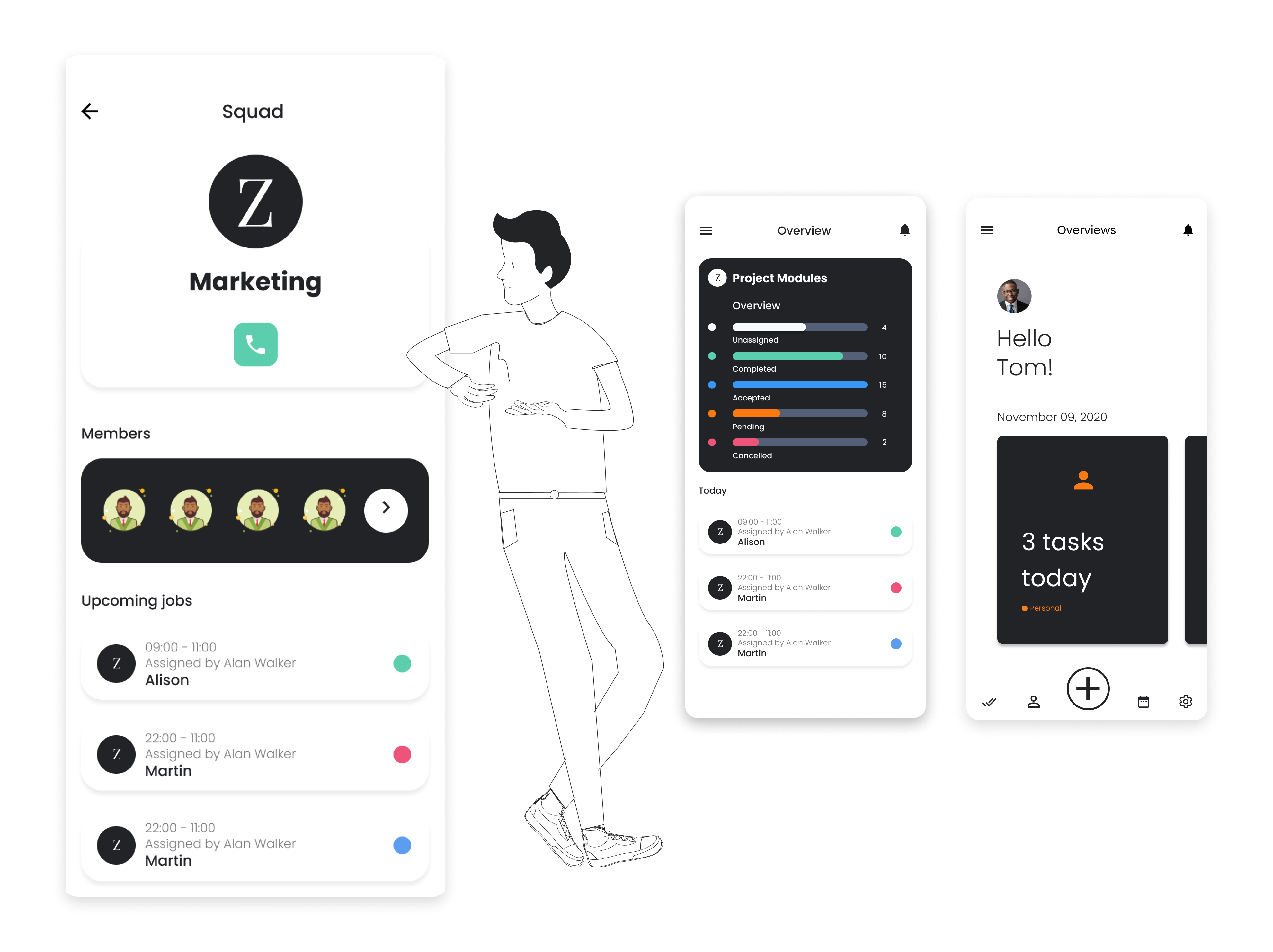
The challenge
Our company was growing, and our many managers were facing issues in managing the workforce because of time constraints and geographically distributed teams. We integrated some leading and expensive Workforce Management applications to fit our needs. But from time to time, there was a need for more features and flexibility because of our demanding staff.
The existing solution was not worthy, and the cost was not justified, so it was better to build an all-in-one solution.
Using the human-centered design methods, I set out to design a solution that would meet the needs of the managers, the objectives of the company, and technical capabilities.
Research
With a clear objective of managing the geographically distributed teams, I decided to spend two days conducting online interviews with 10 managers (Primary users) from different sectors to know their pain points and motivations. These users were facing comparatively more issues in managing their workforce. What they were saying could be different than what they were doing regarding their workforce management, so observing their facial cues was really helpful.
Current workforce solution is impacting 9200 individuals.

Tell me how are you managing your workplace?
What could be the ideal scenarios for workforce management?

Key takeaways:
a) Users want modern and intuitive user-interface
b) Users look for a flexible and efficient application that only suggests available team members for a created shift
c) Can handle unexpected shift changes easily
d)
Users are looking for standalone solutions instead of integrated solutions

How might we empower users by providing them cost efficient standalone workforce platform?
-HMW
It’s hard for me to manage my distributed resources and ensure productivity.
- Brand Manager
Design
The design phases kicked off by planning the information architecture of all Zahio features. Creating a sitemap, task flows, and testing ensured all feature screens were placed in an intuitive flow.

Over the course of a few weeks of testing and iterations, the low-fidelity sketches became a high-fidelity prototype.
Key takeaways:
a) Clear indication if the employee works overtime
b) Visibility of employees’ current location on the map

Tyler, adding a new task in the calendar.


The user-interface design strives to be confident. It contains the right amount of UI elements. We worked for clear and modern typography — choosing colors with high contrast to increase legibility in outdoor, low‑light conditions. The design is uncluttered, clean, large, and well-spaced. All our design decisions help to share a sense of confidence in the design.


Testing Phase
Participants tested all features physical and via online invision prototype. The participant pool was comprised of people between the ages of 22 and 65, and the usability tests were performed remotely with different groups containing 45 people . They were given five different scenarios, each with each task to complete. They were also clearly conveyed the status of tasks in progress or completion. However, users are very demanding as they want more flexibility, for instance, all the details of a task mentioned at once and assignment of the team management responsibility and locations. Some enhancements have been made to create a more efficient and enjoyable experience.


Impact
Engagement Rate
53.5%
Net Promoter Score (NPS)
64
Satisfaction Score
51%%
Average reduced cost by 47% after the launch of first three months.
Data gathered from 5 organizations.
“Finally able to assign a task in few taps, with time & location tracking. It’s more fun now. The shift is changing, but I am stress-free. Revolutionizing the employee-employer relationship.”
- Amy Ashley, Restaurant owner