This short time frame did test my abilities as the research phase was hard due to the language barrier. The product was indeed futuristic, but it did not match with modern online shopping aesthetics, which I tend to cater to.
My Role
Lead designer— research, design
Tools & Technologies
Figma
Duration
Jan 2020 - Feb 2020
Brief
A finished product that retains customers and takes them to the end of the sales funnel, and converts them into customers.
About
Borderless – Cross Hemet is one of its kind 360 vision and voice-enabled technology helmet sellers for bikers both locally & internationally.
Problems
The borderless cross helmet is a futuristic wearable product that faced the following complications.
1. Waste of potential leads
2. No strategised marketing for local & international market
3. Less conversion rate
4. Single payment option
5. Unimpressive product description
Goals
1. To assist potential leads in the sales funnel
2. Improvise marketing efforts
3. Increase user-friendliness
4. Integrate multiple payment options
After a rigorous research phase, I wanted to adjust an explicit micro interactions that encourages people to buy the product. Moreover, it also required a strategy that highlights product positioning for a better understanding.
Adjust HD graphics to give a clear picture of the product along with adding comprehensive content that phrases this pro wearable product the way it should be and can be well-used for search engine optimisation (SEO).
I also suggested a review section alongside the Micro interactions to strengthen the buying decision as discussed with the stakeholders and endorsed in many Journal. The purchasing form should also have lesser fields to continue the buying cycle.
Research
I, along with my team, looked into all aspects that restricted these 360 visions, and voice command featured helmet from becoming a sensation.
Feasibility & Market Analysis
The product was an invention of technology to take the everyday biking experience to the next level. We needed to research a wide and diverse target audience to know why it is not getting the expected feedback.
So, we conducted surveys among the following age group, and based on the demographics of 98% males, their suggestions, and opinions, we concluded our study.
First age group 25–34
Second age group 35–44
Third age group 45–54
Language Barrier バリア
Another big hurdle that led to the communication gap was the language barrier. I had to use translators to know the interests of people and their liking and disliking.
Language Barrier バリア
Design Strategy
I held a competitive analysis of e-commerce giants Amazon and Rakuten. Their user-experience is what offers delightful purchasing satisfaction.
Research Insights
- The product does not give a futuristic design feel to the audience and fail to impress them.
- Limited marketing strategy without focusing on the target audience does nothing for sales.
- Nothing complimented the buying decision of users with a lack of reviews.
- Lack of micro interactions.
Proposed look and feel
Design Prototype: Ideation & Validation
I want to experience this with my friend.
- Use case
My next weekend-long ride.
- Use case
Should experience this Japanese’s high-end technology.
- Use case
Outcome
The company enhances the biking experience with 3D technology and user satisfaction alongside.
Design Principles
- The overall feel of the product should be natural to instinctively connect with the audience.
- The design should exhibit safety features to promote the excellence of the futuristic approach of the product.
- It should radiate a fun experience as per the biking and road culture.
Proposed look and feel
Final Prototype
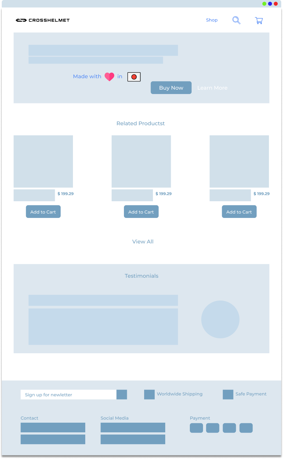
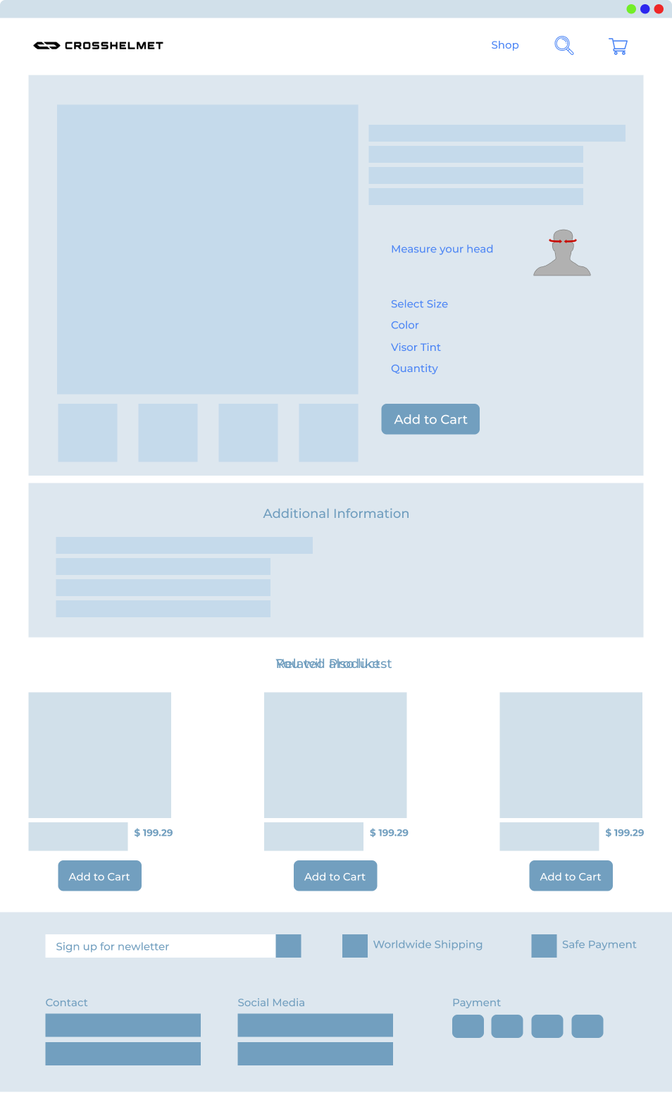
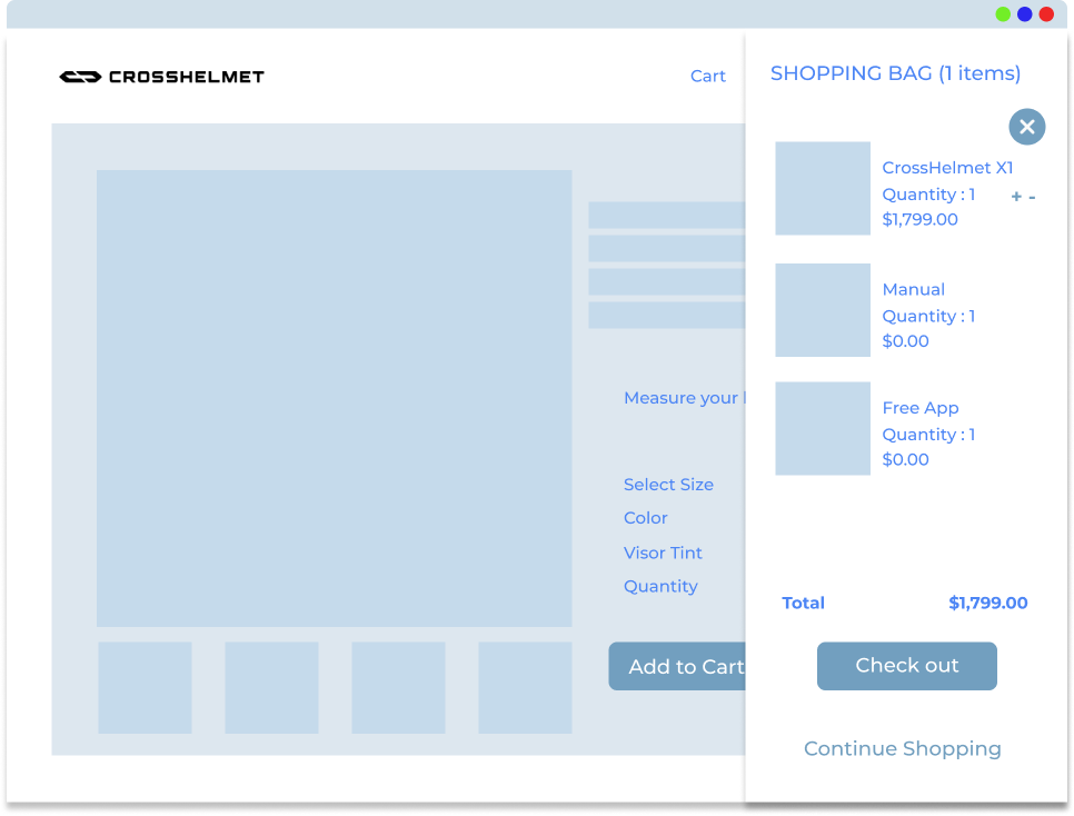
We took the following measures to enhance the shopping experience on CrossHelmet. It not only reflected the futuristic approach of the product but was simple enough to capture the target audience.
- Added external and internal links Land to the online shop
- Attracted user with a striking and conclusive tagline and HD self-explanatory image
- Clear CTA options as “Buy Now & “Learn More”
- Added preferences and customized options for different sizes and colors
- Encouraged user to make the purchase
- Enabled purchase journey steps & militaristic form
- Explicit plan of action to display the end of the buying process
- Added more than one payment options other than PayPal for convenience
Allow user to see what they can achieve from your product or service.
- Key point
Allow user to see what they can achieve from your product or service.
- Key point
Offer several options to the user for their convenience.
- Key point
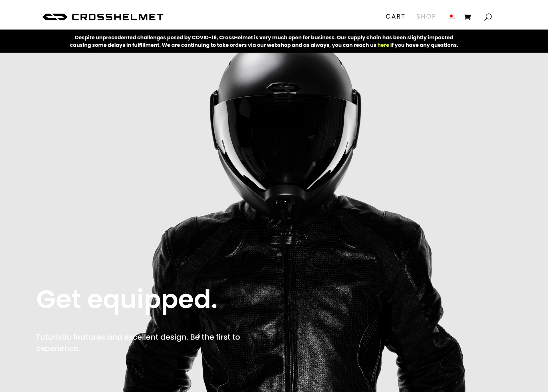
Proposed homepage
Proposed product description
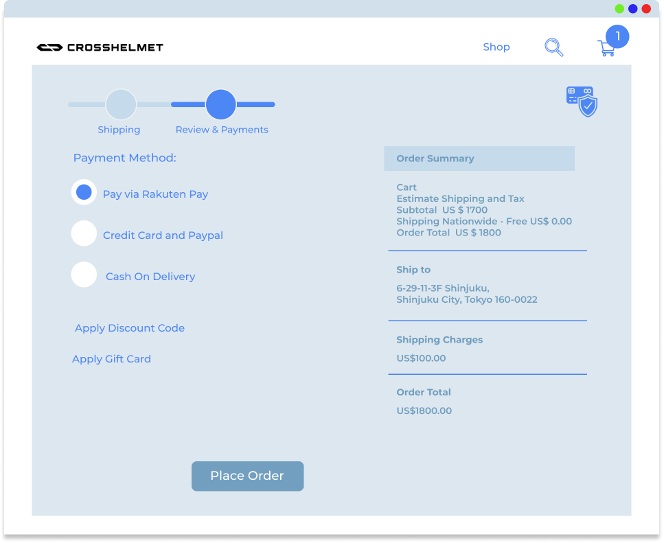
Checkout sidebar
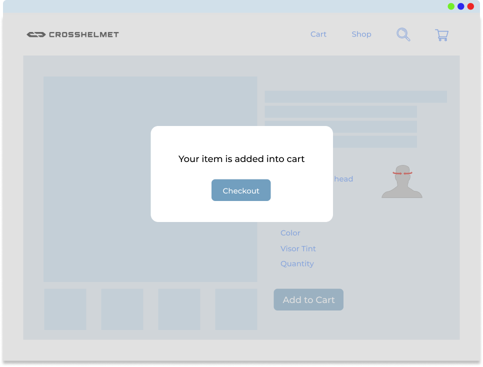
Micro interaction
Multiple payment options
Conclusion
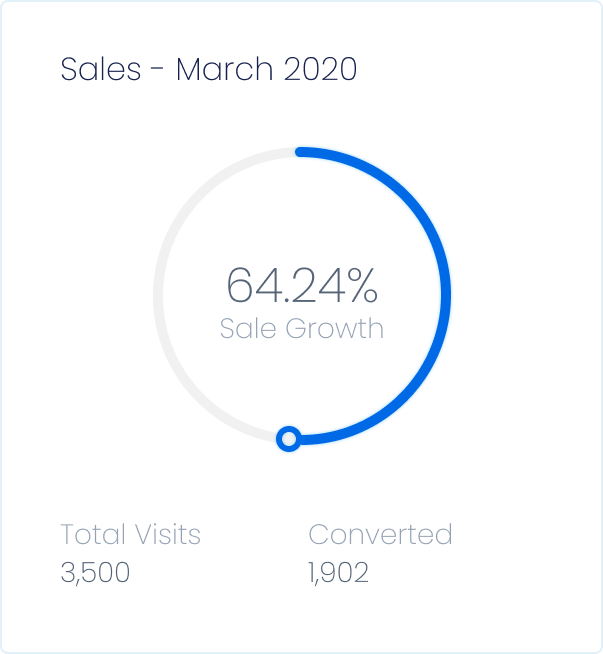
- The online purchase of CrossHelmet increased by 64% after first test.
- The user retention rate improved.
- User-friendliness and engagement enhanced significantly.
- The product was although another level of sophistication, but with my design aesthetics and well-curated elements, the user found it easy to connect with the brand.
- It is a heavy everyday product that enables technology to the biking experience. So, all it needed was a touch of the same level of marketing and design, and it did deliver.